Live chats have revolutionized customer support, offering seamless and instant communication between businesses and their customers.
When building a live chat, there are two main components on the client side: a chat button and a chat window. The chat button is a clickable icon on your website to prompt visitors to start a conversation. The chat window is the interface where the actual conversation occurs.
We will walk through the step-by-step process of building a chat button and the chat window using React. All code is available on this GitHub repo. Let’s dive in!
Setting up the project environment
- Initialize a new React project:
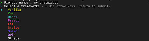
We’re setting up this React project using Vite. To start, cd into the folder where you want the project to be created and run this command:
npm create vite@latest
This command fetches the latest version of the Vite template to scaffold a new project.
Note: Vite requires NodeJS version 18+. 20+. Some templates require a higher NodeJS version to work. Please upgrade your version if your package manager warns about it.
2. Create a project directory:
If you’re not adding this project to an existing folder, Vite will prompt you to create a new directory. If not, skip to number 6.

I named mine my_chatwidget. Next, select a JS framework.
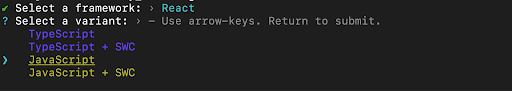
3. Use your down arrow key to navigate to React and click enter:
4. Select a variant and choose JavaScript for this project.
5. Go into your newly created project:
cd my_chatwidget
6. Install node packages and dependencies:
npm install
7. Run this afterward to initialize the project:
npm run dev
Output:
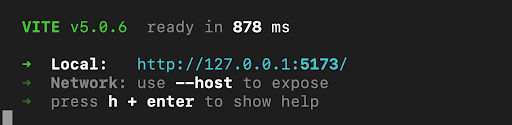
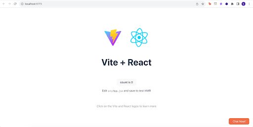
Click on the generated localhost: http://127.0.0.1:5173/ that looks like this:
Your local host URL might look different if the one above has already been taken.
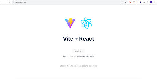
Once the build is successful, let’s build our live chat!
Building a live chat button and chat window
Step 1: Set up file structure
- Create a new directory, “components” within the src folder inside your project directory my_chatwidget:
cd src
mkdir components
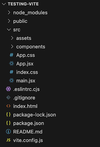
Once this is done, your folder structure should be identical to this:
2. Within the components directory, create a new directory, “ChatWidget”:
cd components
mkdir ChatWidget
3. Inside ChatWidget, create three files:
The index.jsx would contain scripts for the view and logic, while the styles.js file would contain our design for the view. The config.js file would hold reusable values within the component.
touch index.jsx
touch config.js
touch styles.js
Step 2: Build the chat icon
4. Cd to index.jsx, import your external stylesheet:
// import external styling
import { styles } from "./styles";
5. We’ll build our floating button component in the same file using divs and the span tag:
// importing external style
import { styles } from "./styles";
function ChatWidget() {
return (
<div>
{/* Chat Button Component */}
<div
style={{
...styles.chatWidget
}}
>
{/* Inner Container */}
<div
style={{
display: "flex",
alignItems: "center",
justifyContent: "center",
}}
>
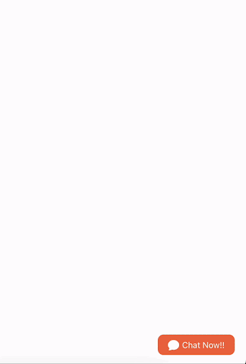
{/* Button Text */}
<span style={styles.chatWidgetText}>Chat Now!!</span>
</div>
</div>
</div>
);
}
export default ChatWidget;
I also added some simple in-line elements to style the display of the floating button. In your styles.js file, add this code to create the chat button.
6. Head over to your external stylesheet, in our case, styles.js
Note: I’m using styled components for styling this project. Styled-components is a JavaScript-based styling approach where the styles are organized under different keys, making it easy to apply specific styles to elements within the component. This approach offers a more dynamic way of styling in React applications, and it allows for easy integration of Javascript logic with styling definitions:
In the external stylesheet, we’ll set the positioning and adjustment of the chatWidget and the color and adjustment of the chatWidgettext.
import { colors } from "./config";

export const styles = {
   chatWidget: {
       // Position
       position: "fixed",
       bottom: "20px",
       right: "20px",
       backgroundColor: colors.primary,
       // Padding
       paddingLeft: "18px",
       paddingRight: "18px",
       paddingTop: "7px",
       paddingBottom: "7px",
       // Border
       borderRadius: "10px",
       cursor: "pointer",
   },

   chatWidgetText: {
       color: "white",
       fontSize: "15px",
       marginLeft: "5px",
   },

}
7. In our config.js file, we would be exporting the variable “colors” which would house colors likely to be repeated during this project.
export const colors = {
   primary: "#ee6e46",
};
8. The next step is to introduce the ChatWidget component we’ve created into our View – essentially, where we want the live chat to be visible.
For this guide, we’ll call our ChatWidget component within the default view generated by Vite at the beginning of this project.
The default view is located in the App.jsx file located in the src folder of your project:
Within the default App.jsx or your preferred view, import the ChatWidget component so that we can call and display it on the webpage:
import ChatWidget from ‘./components/ChatWidget’
Then, add the <ChatWidget /> component before the end of the fragment component in App.jsx :
     <p className="read-the-docs">
       Click on the Vite and React logos to learn more
     </p>
     {/* //Call ChatWidget */}
     <ChatWidget />
   </>
 );
}
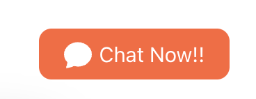
Once this is done, you’ll see a button at the bottom right corner of the webpage.
Expected output:
Step 3: Add an icon to the button component
9. Inside ChatWidget’s folder, install the react icons library to add icons to our application:
npm install react-icons
10. Using this library, add an icon ‘BsFillChatFill’ to our index.jsx file:
// importing external style
import { styles } from "./styles";


// import icon
import { BsFillChatFill } from "react-icons/bs";


....
11. Inside the <div> for the inner container, add the button icon right before the text style, so the icon shows right before the text like so:
<div
         style={{
           display: "flex",
           alignItems: "center",
           justifyContent: "center",
         }}
       >

         {/* Button Icon */}
        <BsFillChatFill size={20} color="white" />
         {/* Button Text */}
         <span style={styles.chatWidgetText}>Chat Now!!</span>
       </div>
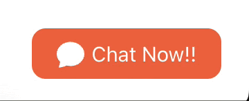
Expected output:
Step 4: Make the floating chat button responsive
Here, we’re doing something simple: showing an effect anytime our button is hovered on. How do we do this?
12. Track when the mouse enters the button view and when the mouse leaves the button view. Luckily, React has handlers like “onMouseEnter” and “onMouseLeave” which we can use to track the state and create an appropriate effect when any events are triggered.
....
import { useState} from "react";


function ChatWidget() {
 // state variable to track if widget button was hovered on
 const [hovered, setHovered] = useState(false);
....
Update your index.jsx file with the script above. We are importing the ‘useState’ hook from react and creating a state variable to track when the widget button was hovered on. This state variable would be instrumental in our logic displaying the appropriate effect.
13. Update our script to set the “hovered” variable to true when the button is hovered on and to false when the mouse leaves the button:
....
function ChatWidget() {
 return (


{/* Chat Button Component */}
     <div
onMouseEnter={() => setHovered(true)}
      onMouseLeave={() => setHovered(false)}
       style={{
         ...styles.chatWidget
       }}
     >
....
14. Change the effect when the hovered state is either true or false. For this example, we would change the border when the mouse is over the button. See the script update:
....
<div
       onMouseEnter={() => setHovered(true)}
       onMouseLeave={() => setHovered(false)}
       style={{
         ...styles.chatWidget,
         ...{ border: hovered ? "1px solid black" : "" },
       }}
     >
....
You will notice the behavior of the button changes with this update to the code. This update makes the button more responsive to a hover event.
Step 5: Design your modal window
15. Create a folder “ModalWindow” in the Chat Widget folder. Within the “ModalWindow” folder, you would create another “index.jsx” file. Here, we’ll design the interface for the modal.
In the new index.jsx file, type the code below;
// importing external style
import { styles } from "./../styles";
//for displaying the model view/Window
function ModalWindow(props) {
    // returning display
    return (
        <div
            style={{
                ...styles.modalWindow,

            }}
        >
            Hello there!
        </div>
    );
}
export default ModalWindow;
Also, observe that we’re trying to style the div using a style key we had not previously set. We’ll do so now.
16. Below, we’re updating the styles.js file with a style object containing the CSS styles for our modal window:
chatWidgetText: {
   color: "white",
   fontSize: "15px",
   marginLeft: "5px",
 },


// Styling for model window
  modalWindow: {
    // Position
    position: "fixed",
    bottom: "70px",
    right: "20px",
    // Size
    width: "370px",
    // width: "420px",
    height: "65vh",
    maxWidth: "calc(100% - 48px)",
    maxHeight: "calc(100% - 48px)",
    backgroundColor: "white",
    // Border
    borderRadius: "12px",
    border: `2px solid ${colors.primary}`,
    overflow: "hidden",
    // Shadow
    boxShadow: "0px 0px 16px 6px rgba(0, 0, 0, 0.33)",
  },
17. Cd back components/ChatWidget/index.jsx, and call ModalWindow to make it visible on your page:
function ChatWidget() {
    // state variable to track if widget button was hovered on
    const [hovered, setHovered] = useState(false);
    return (
        //Container
        <div>
            {/* Call Modal Window */}
            <ModalWindow />

            <div
Still at components/ChatWidget/index.jsx, import ModalWindow
import { BsFillChatFill } from "react-icons/bs";
// import external styling
import { styles } from "./styles";
//import ModalWindow
import ModalWindow from "./ModalWindow";
Expected Output:
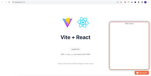
18. If your Vite + React landing page is on dark mode — you won’t see the ‘Hello there’ header at the top.
Navigate to index.css in your root directory, and change your color from rgba(255, 255, 255, 0, 0.87) to black so the text shows:
 color-scheme: light dark;
 color: black;
 background-color: #242424;
Step 6: Make the modal functional
At this point, your static modal window should be displayed on your webpage. However, what makes a modal a modal is its ability to pop in and pop out. So, we must make our modal show or hide when the button clicks.
19. Head over to the index.jsx file in the ModalWindow directory. Here, the ModalWindow component accepts a prop “visible,” which controls the modal display using the opacity style property.
//If visible is true; opacity is 1, else 0
    return (
        <div
            style={{
                ...styles.modalWindow,
                ...{ opacity: props.visible ? "1" : "0" },

            }}
        >
             <span>Hello there!</span>
        </div>
…..
"Opacity" is a CSS property being dynamically set based on the value of props.visible. The opacity property controls the transparency of an element, with a value of "1" indicating full opacity (fully visible) and "0" indicating complete transparency (completely hidden). So, this part of the code dynamically adjusts the opacity of the <div> based on the value of props.visible.
20. Update the 'index.jsx' file within the 'ChatWidget' folder. Remember that this file houses the ChatWidget component, the parent component responsible for rendering various elements, including the modal window we discussed. Add a state variable here to track modal visibility status:
function ChatWidget() {
    // state variable to track if widget button was hovered on
    const [hovered, setHovered] = useState(false);
    // state variable to track modal visibility
    const [visible, setVisible] = useState(false);
21. Next, update the same file to set the visibility status when clicking the button:
Currently, we’ve already created a state variable to track the visibility status (const [visible, setVisible] = useState(false);)
On click, the state variable changes from false to true:
....
{/* Chat Button Component */}
     <div
       onClick={() => setVisible(!visible)}
       onMouseEnter={() => setHovered(true)}
        onMouseLeave={() => setHovered(false)}
....
22. Finally, pass the value of our state variable down to the ModalWindow component using the prop “visible”:
return (

        //Container
        <div>
            {/* Call Modal Window */}
            <ModalWindow visible={visible} />
Expected Output:
You’ll observe that the modal is now triggered to display or close with the click of a button.
Step 7: Make the modal functional (Part II)
Kudos if you've been following up to this point! We've successfully built a modal widget from scratch, but there's one secret ingredient missing (our modal doesn't close when we click outside 😱).
Currently, it only closes when we click the widget button. In this next step, we'll upgrade our solution to close the modal when a click event happens outside the modal area.
Here's how we'll do it in a few simple steps:
23. In the 'index.jsx' file for our ChatWidget component, we'll create a listener to detect when the mouse is pressed down. Using a useRef, we'll determine if this event occurred within or outside the ChatWidget component.
function ChatWidget() {
    // state variable to track if widget button was hovered on
    const [hovered, setHovered] = useState(false);
    // state variable to track modal visibility
    const [visible, setVisible] = useState(false);
    //creating a ref 'id'
  const widgetRef = useRef(null);
  // use effect listener to check if the mouse was cliked outside the window
  useEffect(() => {
    function handleClickOutside(event) {
      if (widgetRef.current && !widgetRef.current.contains(event.target)) {
        setVisible(false);
      }
    }
    document.addEventListener("mousedown", handleClickOutside);
    return () => {
      document.removeEventListener("mousedown", handleClickOutside);
    };
  }, [widgetRef]);
24. Assign the reference object widgetRef to our div container using the ref property:
return (

        //Container
        <div ref={widgetRef}>
            {/* Call Modal Window */}
            <ModalWindow visible={visible} />
Here, we introduced "useRef," a powerful React hook that lets us create a reference to a DOM element or a mutable object. This reference persists across renders without triggering a re-render, providing a way to "remember" values.
In our case, "useRef" helps create "widgetRef", a reference to the container element of our ChatWidget component. This reference proves useful for determining if a click event occurs outside the ChatWidget. The "handleClickOutside" function, which we'll discuss shortly, checks if the click target is outside the ChatWidget by comparing it with the "widgetRef." If the click happens outside, we hide the modal.
Now, let's delve into the event listener part. To handle clicks outside the widget, we use "useEffect," another React hook. "useEffect" manages the lifecycle of our event listener. It runs after the component renders, allowing us to perform side effects.

The "useEffect" lets us add an event listener for mouse clicks when the ChatWidget component is mounted. The event listener is created by the "document.addEventListener" method. When a mouse click occurs, the "handleClickOutside" function is invoked. It checks if the click target is outside the ChatWidget by comparing it with our "widgetRef." If the condition is met, we take the desired action—in this case, hiding the modal.
The cleanup phase is also handled by "useEffect". It ensures that the event listener is removed when the component is unmounted. This is crucial for preventing memory leaks and ensuring efficient use of resources.
So, in summary, "useRef" assists in referencing the DOM element, and "useEffect" helps manage the lifecycle of our event listener, ensuring a clean and efficient solution for handling clicks outside our widget.
Wrapping Up
Congratulations on completing your project! Remember, the source code is available in this GitHub repository.
The clickable chat button and window frame are just initial steps in enhancing the customer experience for prospects and existing customers.
To improve your chat window further, consider incorporating other chat features such as typing indicators, emoji reactions, 1:1 messaging, seen/send indicators, and chat receipts.
We would love to hear about what you build using React and Ably! Feel free to share your progress by tweeting @ablyrealtime or contacting us on /r/ablyrealtime.