One of the most common UI elements in software is the tried and true data grid. The idea of organizing data into rows and columns dates back thousands of years. Though human creativity has given us many more ways of displaying data, the humble grid remains a powerful tool in the software developers toolbelt.
Today, however, working with any data, including data in grids, often benefits from collaboration capabilities that allow multiple users to work together on the same data.
In this post I’ll show you how, using the AG Grid component and Ably Spaces, you can create a React application that allows users to see not only who else is currently viewing the grid, but using a Flowbite Avatar Stack component, what row each user currently has selected.
Read on to start building or, if you’d rather jump straight to the finished code, check out this GitHub repo.
Prerequisites
Before you start to build you’ll need to make sure you’ve got an Ably account. You can sign up today for free and use our generous free tier.
We’ll also be using a starter kit application as the base of this application. The starter kit sets up a Vite React project with a single API endpoint used to generate an Ably Token Request. That Token Request allows the Ably client to authenticate itself safely. You can use giget a git cloning tool to clone the repo to your local machine:
npx giget@latest gh:ablydevin/starter-kits/vite-react-javascript realtime-datagrid-demo
cd realtime-datagrid-demo
Once you’ve cloned the starter kit, create a copy of the example environment variables file:
cp .env.example .env.local
And drop your Ably API key in. If you’re not sure where to find your Ably API key, don’t worry we have a great article that walks you through that.
VITE_ABLY_API_KEY="[YOUR_ABLY_API_KEY]"
Once you’ve added your API key you are ready to test the start ket app by running npm run dev. Vite will start a local website and give you a URL you can load in your browser to view the app.

Set up a Space
With the start kit app configured and running the next step is to create a Space within the app. A Space is a virtual area of your application in which realtime collaboration between users can take place. You can have any number of virtual spaces within an application, with a single Space being anything from a web page, a sheet within a spreadsheet, an individual slide in a slideshow, or the entire slideshow itself
In this application, we only need a single Space and it will encompass the entire application.
Start by installing the Ably Spaces SDK:
npm install @ably/spaces
Connect a Space to Ably by creating a SpacesProvider. Import the SpacesProvider and SpaceProvider components into main.jsx:
import Spaces from '@ably/spaces'
import { SpacesProvider, SpaceProvider } from '@ably/spaces/react'
Create a new Spaces object, passing the existing Ably client to it. Wrap the <App /> component inside of a single SpaceProvider, which itself is wrapped inside of the SpacesProvider.
const client = new Ably.Realtime.Promise({ authUrl: "/api/ably/token" });
const spaces = new Spaces(client);

ReactDOM.createRoot(document.getElementById("root")).render(
  <React.StrictMode>
    <AblyProvider client={client}>
      <SpacesProvider client={spaces}>
        <SpaceProvider
          name="datagrid"
          options={{ offlineTimeout: 10_000 }}
        >
          <App />
        </SpaceProvider>
      </SpacesProvider>
    </AblyProvider>
  </React.StrictMode>,
);
Next, import the useSpace hook into App.js
import { useAbly } from "ably/react";
import { useSpace } from '@ably/spaces/react'
The `useSpace` hook lets you subscribe to the current Space and receive Space state events and get current Space instance.
Use that instance inside of the useEffect hook to register the client as a member of this Space:
function App() {
  const client = useAbly();
  const { space } = useSpace();

  useEffect(() => {
    space?.enter({ clientID: client.auth.clientId });
  }, [space]);

  // ...
}
Fantastic. We’ve created a Space and registered the client as a member of that Space. Soon we’ll use the Spaces SDK to learn about other members of the Space and display them in our application.
Add an AG Grid
Next let's add an AG Grid component to our application, provide it with some data, and configure it to be able to display the Space members in each grid row.
Use npm to install AG Grid Community, AG Grid React, and Immer, a package that will help us work with immutable state more conveniently.
npm install ag-grid-community ag-grid-react immer use-immer
In App.js, import the AgGridReact component and useImmer hook. Now is also a good time to import the AG Grid CSS styles.
import { AgGridReact } from "ag-grid-react";
import { useImmer } from "use-immer";

import "ag-grid-community/styles/ag-grid.css"; // Core grid CSS, always needed
import "ag-grid-community/styles/ag-theme-alpine.css"; // Optional theme CSS
Next, create an array that contains the grid data. Here we’re using some made-up auto price data, but you could use whatever you want.
const [rowData, updateRowData] = useImmer([
  {
    id: "a",
    make: "Toyota",
    model: "Celica",
    price: 35000,
    rowMembers: []
  },
  {
    id: "b",
    make: "Ford",
    model: "Mondeo",
    price: 32000,
    rowMembers: []
  },
  {
    id: "c",
    make: "Porsche",
    model: "Boxter",
    price: 72000,
    rowMembers: []
  },
]);
Each object in our data array contains four properties:
id: This is a unique identifier - if this was a database it would be auto-generated.make: The make of the auto.model:The model of the car.price:The price of the car.rowMembers:An array used to hold the ID’s of Space members.
Note that we’re using the useImmer hook to store the array. As mentioned earlier, Immer simplifies working with immutable data. In our case, it will make it much easier to mutate the rowMembers arrays as users select different grid rows.
Now define an array that contains the grid column definitions. The make, model, and price columns are straightforward, but displaying the row ID and row members is a little more complicated.
const [columnDefs, setColumnDefs] = useState([
  { headerName: "Row ID", valueGetter: "node.id" },
  {
    field: "rowMembers",
    cellRenderer: (props) => {
      return (
        <>
          {props.value.length > 0 ? (
            <div>{props.value.toString()}</div>
          ) : (
            <div>None</div>
          )}
        </>
      );
    },
  },
  { field: "make" },
  { field: "model" },
  { field: "price" },
]);
To get the unique ID of each row you use the valueGetter property to get the ID assigned to each node or row. AG Grid can auto-generate those ID’s or like in our case, use the ID that we are providing in each data object.
Displaying the rowMembers is also unique in that we want to insert a custom UI containing an AvatarStack into each row and bind the rowMembers array to that AvatarStack. To do this we use the cellRenderer property. For now, when the array has values, we’ll render the array as a string. Later we’ll add the AvatarStack component.
const getRowId = useMemo(() => {
  return (params) => params.data.id;
})

return (
  <>
    <div>{ client.auth.clientId }</div>
    <div className="ag-theme-alpine" style={{ height: 400, overflow: 'hidden'}}>
      <AgGridReact
        rowSelection="single"
        rowData={rowData}
        rowHeight={50}
        columnDefs={columnDefs}
        getRowId={getRowId}
      />
    </div>
  </>
);
Create a memoized constant that holds the row datas unique identifiers (make sure you remember to import the `useMemo` function) and then replace the default JSX in `App.jsx` with theAgGridReact component.
The grid is bound to the row data, column definitions, and row ID’s. It also has rowSelectionconfigured as “single”.
Finally, before you test the application, we need to tweak one small bit of the application's CSS. The <body> element is configured with its display property set to flex. This will constrain the grid to a very narrow display which makes it hard to view the grid data. To fix this, open the index.css file, locate the body element, and remove or comment out the display: flex attribute.
body {
  margin: 0;
  /* display: flex; */
  place-items: center;
  min-width: 320px;
  min-height: 100vh;
}
Test the application and you should see a grid with data that allows for row selection.
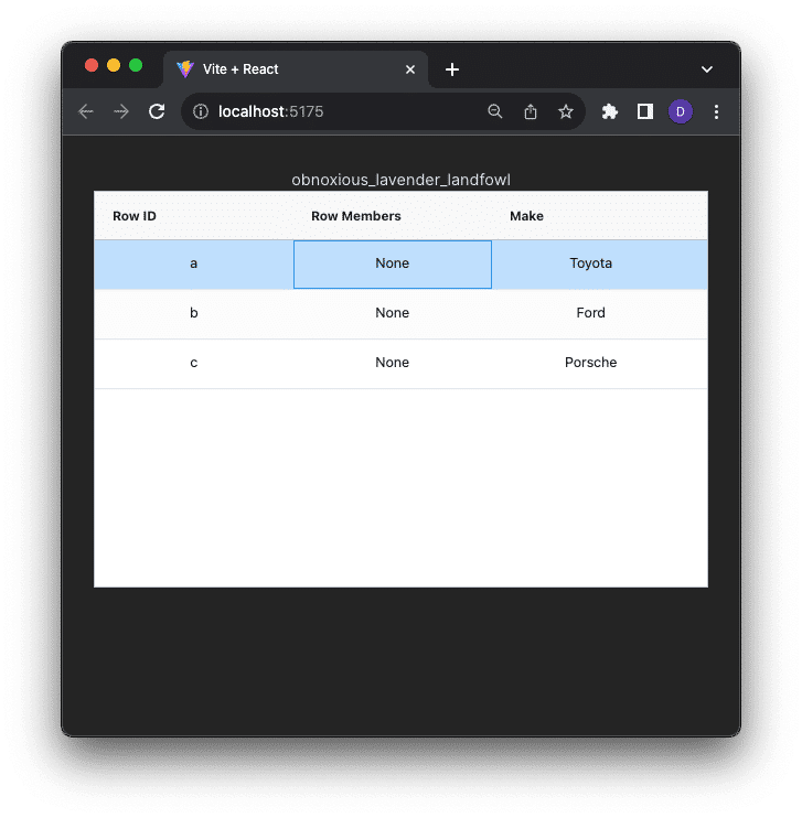
The Row Members column will display “None” for now because we haven’t connected the row selection event. We will do that next.
Change row selection and member locations
As users select different rows, we want to display all of the users who have that same row selected as an AvatarStack in that row. We need a way to keep track of every user’s location. Recall that the grid exists inside of a Space, a virtual area of the application in which realtime collaboration between users can take place. Because all users of our application are members of the same Space we can use the member location to track which row they currently have selected, and then communicate that to all other members in real time.
The member location feature enables you to track where members are within a Space, to see which part of your application they’re interacting with. A location could be the form field they have selected, the cell they’re currently editing in a spreadsheet, or the slide they’re viewing within a slide deck. Multiple members can be present in the same location.
We’ll use AG Grid’s onRowSelected event to update the location of a member. We’ll also use the Ably Spaces useLocation hook to listen for member location changes and update the grid data.
Start by creating a function that mutates the rowMembers arrays based on a member’s previous and current locations in the Space. Make sure you import the useCallback function into the page. We’re using useCallback to have React cache the function definition between rerenders.
const mutateMemberLocations = useCallback((previousLocation,nextLocation,clientId) => {
  updateRowData((draft) => {
    if (previousLocation) {
      const rowIdx = draft.findIndex((row) => row.id === previousLocation);
      const memberIdx = draft[rowIdx].rowMembers.indexOf(clientId);
      if (memberIdx > -1) {
        draft[rowIdx].rowMembers.splice(memberIdx, 1);
      }
    }
    if (nextLocation) {
      const rowIdx = draft.findIndex((row) => row.id === nextLocation);
      if (draft[rowIdx]) {
        if (!draft[rowIdx].rowMembers.includes(clientId)) {
          draft[rowIdx].rowMembers.push(clientId);
        }
      }
    }
  });
}, []);
When updateRowData is called the function first checks to see if the members clientId was in a previous location and if so, removes them. It then checks to see if there is a new location and if there it adds the member’s clientId to that rowMembers array.
This is where using Immer helps us. Immer gives us a draft, or a copy, of the row data to mutate as we see fit. Once we’re done and the updateRowData function exists, Immer takes care of merging the changes from our draft into a new copy of the data object, which triggers the state change events in React and UI updates that are required.
We want to update the row data anytime a member’s location changes. To know about location changes we can use the useLocations hook. Add it as an import to App.js:
import { useSpace, useLocations } from "@ably/spaces/react";
useLocation gives you a function to call to update the member location and a callback to listen for member location changes. Use the callback to run the mutate function, passing in the previous location, current location, and id of the member whose location changed.
const { update } = useLocations((location) => {
  mutateMemberLocations(
    location.previousLocation?.nodeid,
    location.currentLocation.nodeid,
    location.member.clientId
  );
});
Reacting to location changes is great, but how do we change a member’s location in the first place? We’ll use the AG Grid onRowSelected event to do that.
The onRowSelected event is called both when a row becomes unselected and selected so first check to make sure the row passed in is the newly selected one. Then use the update function to change the Space member location:
const onRowSelected = async (e) => {
  if (e.node.isSelected()) {
    update({ nodeid: e.node.id });
  }
};
Don’t forget to add the onRowSelected property to the grid component and bind it to the onRowSelected function.
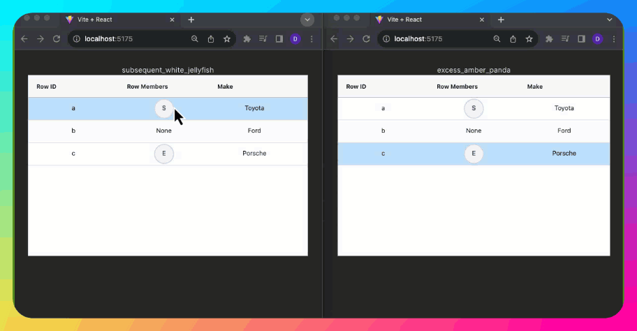
Test the application again. When you select a row the member of that row should be shown. Open a second tab and load the site. Select a row and now both members of the Space should be reflected in the row members column.

Add an Avatar Stack
Now that the app is displaying members, let’s change the column to show them using an Avatar Stack. Avatar Stacks are a common way of showing the online status of members in an application by displaying an avatar for each member. We’ll use the Avatar component that’s included in the Flowbite component library.
To use Flowbite in our project you will need to install the packages and configure the React application to import the resources. The Flowbite website has a fantastic integration guide that walks you through this process. You can also check out the Ably blog post: How to create an Avatar Stack using Ably and Flowbite React to learn more about installing and using the Flowbite Avatar component in a React application.
Once you have Flowbite installed, create a new component named AvatarStack.tsx. Import the Avatar component and then using the map function, generate an array of Avatar components, one for each row member. Stack the avatars together by using the <Avatar.Group> component and by binding the array of Avatars as the child components of the group.
"use client";
import { Avatar } from "flowbite-react";
function AvatarStack({ members }) {
  const avatars = members.map((m) => (
    <Avatar
      key={m}
      rounded
      stacked
      placeholderInitials={m.toUpperCase().substring(0, 1)}
    />
  ));
  return (
    <div id="avatar-stack" className={`example-container`}>
      <Avatar.Group>{avatars}</Avatar.Group>
    </div>
  );
}
export default AvatarStack;
Finally, import the AvatarStack component into App.js and add it to the cellRenderer of the column.
import AvatarStack from "./AvatarStack";
return (
  <>
    {props.value.length > 0 ? (
        <AvatarStack members={props.value} />
      ) : (
        <div>None</div>
      )}
  </>
);
Test the application and now, instead of a string of client IDs, you should see an AvatarStack displayed for each row with members in that location.
Again, open a second tab and as you select different rows, you should see the Avatar stack synchronized across both browsers.
Set up initial member state
Notice when you open the application in a second tab, existing row members that have selected rows in the first tab are not reflected. It’s not until you select a row in the second tab that existing members are shown. Ideally, we’d show member locations as soon as the grid loads, but right now we only get member location info from row selection changes.
Let’s change the application to show the existing state when the page loads. To do that use the Ably Spaces useMembers hook. useMembers retrieves members of the Space, including members that have recently left the Space, but have not yet been removed. It provides three functions we can use to get member information:
self: A member’s member object.others: An array of member objects for all members other than the member themselves.members: An array of all member objects, including the member themselves.
Start by importing the useMembers hook into App.js and then grab the others function:
const { others } = useMembers();
Next, loop through each existing “other" member, calling the mutation function to update the grids row members:
useEffect(() => {
  others.forEach((member) => {
    if (member.lastEvent.name == 'present') {
      mutateMemberLocations(null, member.location?.nodeid, member.clientId)
    } else if (member.lastEvent.name == 'leave') {
      mutateMemberLocations(member.location?.nodeid, null, member.clientId)
    }
  })
}, [others]);
Notice how the loop checks to see if the member’s last event was present or leave. Members fire the present only if they were already in the room when the requesting member joined.
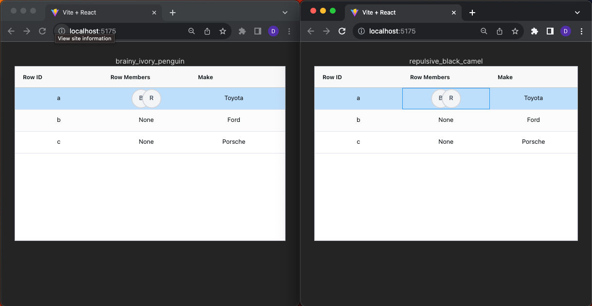
Test the application one more time. Select a row in the first browser and then open the site in a second browser. This time the location of the first member should be shown right away without any interaction with the grid required.
Wrapup
Congratulations, you did it! Using React, AG Grid, and Ably Spaces you’ve built a collaborative data grid that allows users to see in real time the selected row of other grid users. This makes it easier for multiple users to collaboratively navigate the grid together.
Grid collaboration doesn’t need to stop there though. Using the Component Locking feature of the Ably Spaces SDK you could control simultaneous editing of grid data, allowing users to lock cells while editing data to prevent accidental data overwrites.
Additionally, if you’re using the Enterprise version of AG Grid, then you could enable range selection rather than whole-row selection. Using range selection and the same Location capabilities of the Spaces SDK you could create a Google Sheets-style cell-level collaboration experience.
What collaborative grid features do you use? Let me know. Drop an email to [email protected], hit me up at @ablydevin on X (Twitter), or message me on LinkedIn.