
Websites and apps are slowly starting to integrate more collaborative features as a means of increasing interactivity and the functionality of various use-cases. Be it a collaborative document or a chat room, one common feature is to show who else is in the space with you.
Typically this’ll be done with an Avatar Stack, a collection of icons, each representing a client connected to the space. Usually these’ll have useful features such as a dot to indicate whether they’re active, as well as providing useful app-dependent interactions, for example a button to take you to where said user is in a text document.
In this blog post, we’ll demonstrate how you can easily get started with making your own Avatar Stack in React, making use of Flowbite and Ably.
You'll be able to find all the code used in this blog post on GitHub.
What is Flowbite?
Flowbite is an open-source UI component library built on top of Tailwind CSS. They provide a React library, which makes it quick to make the skeleton of a website. Importantly for this demo, they provide Avatar Stack UI elements straight out of the box.
Setting up the React App
To get started, we’ll use Vite to create a React package in JavaScript:
npx giget@latest gh:ablydevin/starter-kits/vite-react-javascript avatar-stack
cd avatar-stack
1. Install Tailwind
In the new project, let’s install tailwind and the other various packages required for us to make use of Flowbite with npm:
npm install -D tailwindcss postcss autoprefixer
Next, let’s instantiate our tailwind.config.js file:
npx tailwindcss init -p
Now, configure the template paths inside the tailwind.config.js file. These’ll allow for tailwind to work properly with Flowbite:
/** @type {import('tailwindcss').Config} */
export default {
    content: [
        './src/**/*.{js,jsx,ts,tsx}',
    ],
    theme: {
        extend: {},
    },
    plugins: [],
}
Finally for Tailwind, set up the Tailwind directives inside the ./src/index.css file at the top:
@tailwind base;
@tailwind components;
@tailwind utilities;
2. Install Flowbite
Install Flowbite and Flowbite React by running the following command in your terminal:
npm install flowbite flowbite-react
With flowbite installed, update the `plugins` section of the `tailwind.config.js` file to require flowbite:
module.exports = {
    plugins: [
        require('flowbite/plugin')
    ]
}
Additionally to your own content data you should add the Flowbite source paths to apply the classes from the interactive elements in the tailwind.config.js file:
module.exports = {
    content: [
        // ...
        'node_modules/flowbite-react/**/*.{js,jsx,ts,tsx}'
    ]
}
3. Install Ably
With Flowbite set up, the last thing we need to install is Ably:
npm install ably
Authentication with Ably
With everything installed, we can start setting up our Avatar Stack. As we’ll be using Ably for handling the synchronization between clients of who is present, names, and so on, we’ll need to get an API key to authenticate with Ably.
Sign up for an Ably Account for free, and then create an app in your Dashboard. Once you have an App, go to the app’s API keys and copy one. We’ll be using this to generate tokens for our end-users to use.
Creating a .env.local File
Equipped with the Ably API key, let’s create a .env.local file in the root of the project directory to store it. This file should look like:
VITE_ABLY_API_KEY=your-ably-api-key
Make sure to replace your-ably-api-key with your actual API keys from Ably.
Creating the Ably Authentication Endpoint
As part of starter-kits repo we’ve cloned as part of this blog, we have a file called /src/api/ably/token.js, which contains what will be our API endpoint for generating an Ably API key. It should look like this:
import Ably from "ably/promises";

export const GET = async (req, res) => {

 // Your application should perform some type of user
 // authorization to validate that the user is allowed
 // to receive a token before fulfilling the token request
 // if (requesting_user.isAuthenticated) {

    const client = new Ably.Rest(import.meta.env.VITE_ABLY_API_KEY);
    const tokenRequestData = await client.auth.createTokenRequest({
      clientId: 'Random Client ID',
    });
    console.log(`Request: ${JSON.stringify(tokenRequestData)}`);
    return res.json(tokenRequestData);

  //} else {
 // res.status(401).json({ 'error':'User is not authorized' })
  //}
};
We want to generate a random clientId for each user, so replace the `clientId: ‘Random Client ID’ with the following:
    const clientId = Math.random().toString(36).substring(2, 15) + Math.random().toString(36).substring(2, 15);
    const tokenRequestData = await client.auth.createTokenRequest({
      clientId: clientId,
    });
Try running the app here with npm run dev to make sure everything works. If you go to the http://localhost:5173/api/ably/token URL, you should see a JSON token response in the browser.
Creating the core App
With the endpoint set up, we can finally get to the exciting bit; creating the Avatar Stack.
Firstly, update the #root style in App.css to:
#root {
  width: 100%;
  margin: 0;
  text-align: center;
}
Setting up the Ably Spaces SDK
Next, let’s update the imports of our App.jsx file to include Ably, as well as import a file we will soon be adding, AvatarStack:
import './App.css';
import AvatarStack from './AvatarStack';
import Spaces from "@ably/spaces";
import { SpacesProvider, SpaceProvider } from "@ably/spaces/react";
import { Realtime } from 'ably/promises';
With Ably imported, we can instantiate a connection to Ably, which we use to instantiate the Spaces library. We can then wrap our upcoming AvatarStack component with an SpacesProvider so that Ably’s available to it:
function App() {
  const ably = new Realtime.Promise({ authUrl: 'api/token' });
  const spaces = new Spaces(ably);
  return (
    <>
      <SpacesProvider client={spaces}>
        <SpaceProvider name="avatar-stack">
          <AvatarStack />
        </SpaceProvider>
      </SpacesProvider>
    </>
  )
}

export default App
Creating the Avatar Stack
With our SpacesProvider ready, create a new file, AvatarStack.jsx in /src. Add the following base code to it:
'use client';

import { useEffect } from "react";
import { Navbar } from 'flowbite-react';
import { useSpace, useMembers } from "@ably/spaces/react";


function AvatarStack() {
// Connect to Ably Space and enter set of connected clients

  return (
    <div id="avatar-stack" className={`example-container`}>
      <Navbar fluid rounded>
        <Navbar.Brand href="/">
          <span className="self-center whitespace-nowrap text-xl font-semibold dark:text-white">Avatar Stack Demo</span>
        </Navbar.Brand>
        <div className="flex flex-wrap gap-2">
          // Add Avatars
        </div>
      </Navbar>
    </div>
  );
}
export default AvatarStack;
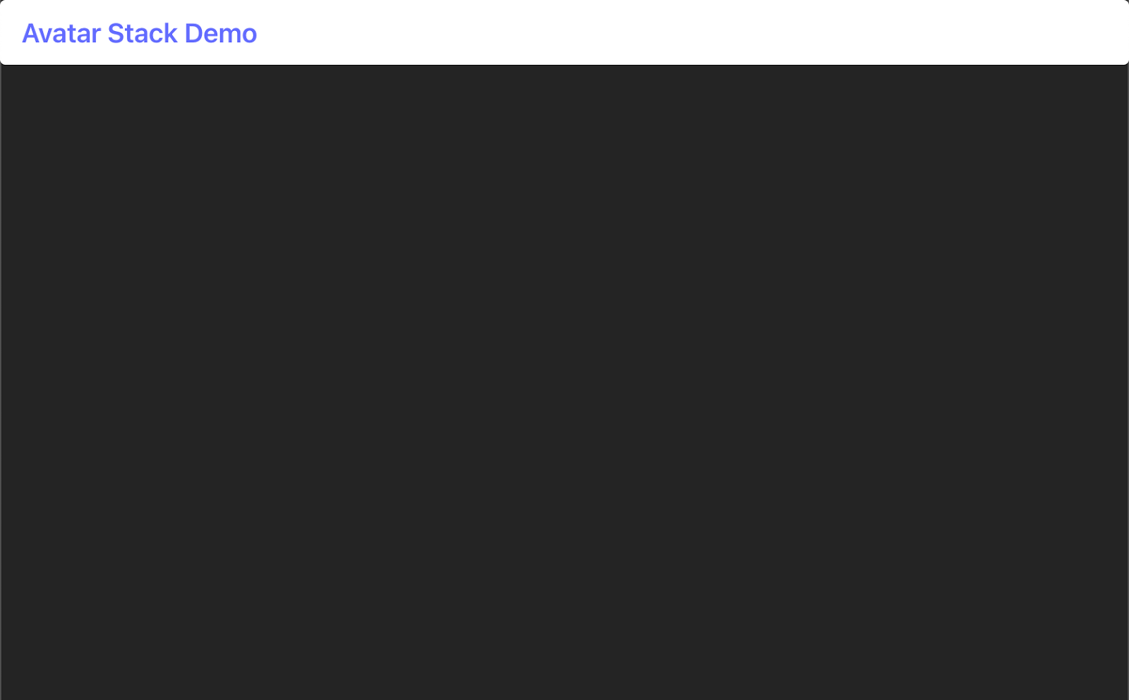
Here we have a very simple page, with a header bar. We’ll be adding our Avatar Stack to the right end of this header bar.
Creating an Avatar
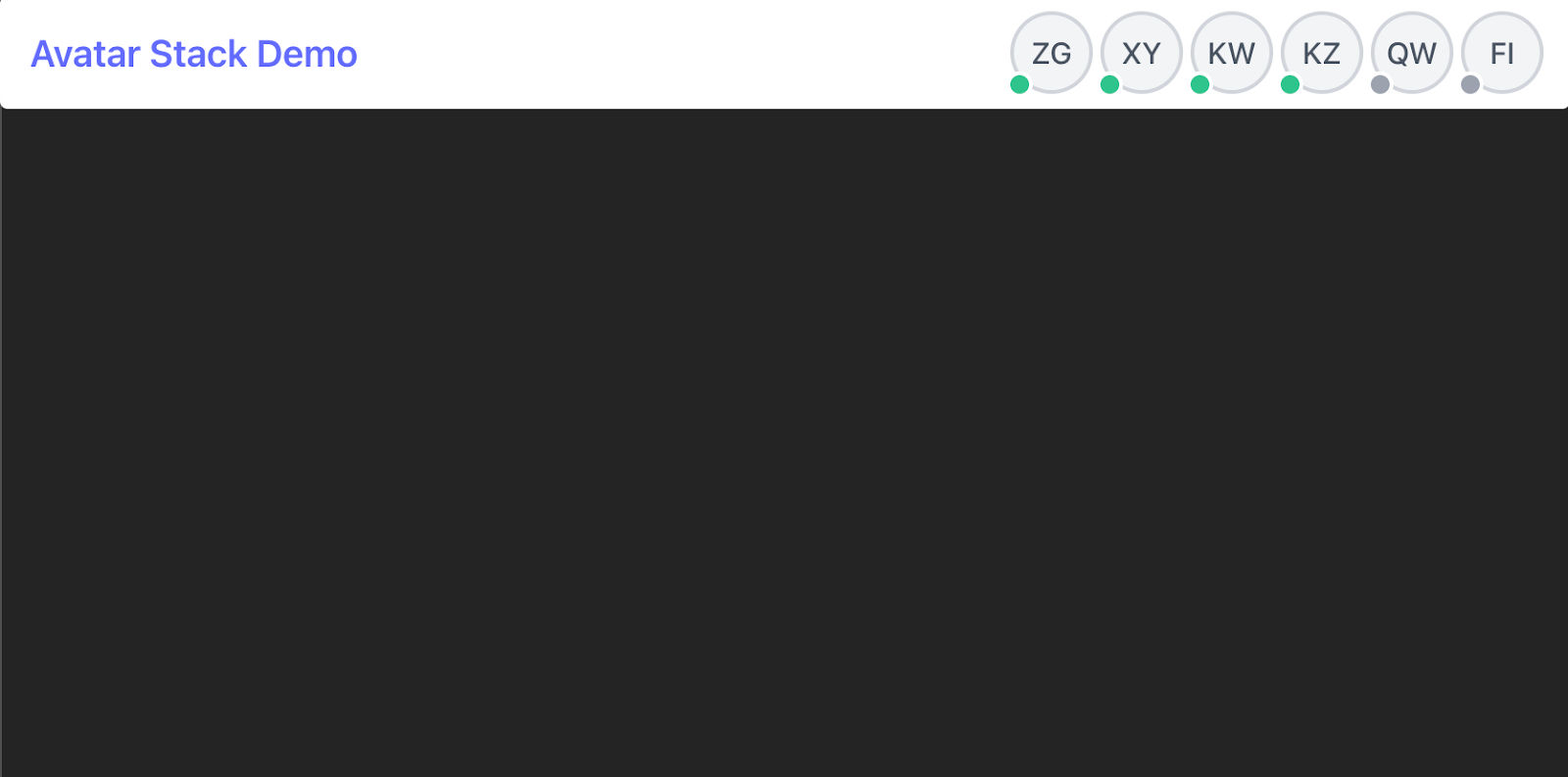
Let’s set up what our Avatars will look like. We’ll have it so that our clients appear as a pair of initials, and that each Avatar has an indicator on it, which’ll be green if they’re active in the room, and red if they’re currently inactive.
Create a new file in /src called AblyAvatar.jsx, and add the following to it:
import { Avatar } from 'flowbite-react';

const AblyAvatar = ({ user }) => {
    if (!user) return (<></>);

    return (
        <Avatar placeholderInitials={user.profileData.name} color={user.profileData.memberColor} rounded stacked status={user.isConnected ? 'online' : 'offline'} statusPosition="bottom-left" />
    );
};

export default AblyAvatar;
Here we are expecting an object to be passed in, which contains the initials of the user, a color for the border of their Avatar, and their online status. The isConnected field is auto-generated in Ably to represent if a client is connected or not.
Generating user details
Now, let’s go back to the AvatarStack.jsx file to make use of this AblyAvatar component. Implement two functions at the top of the file, just below the imports, which’ll allow us to generate a random color and name initials for a user. We’ll also import the AblyAvatar file:
'use client';

import {useEffect } from "react";
import AblyAvatar from "./AblyAvatar";
import { Navbar } from 'flowbite-react';
import { useSpace, useMembers } from "@ably/spaces/react";

function generateTwoLetterString() {
  let result = '';
  for (let i = 0; i < 2; i++) {
      result += String.fromCharCode(65+Math.floor(Math.random() * 26));
  }
  return result;
}

// Generate a random color name
function generateRandomColor() {
  const colors = [
    'red',
    'orange',
    'yellow',
    'green',
    'blue',
    'purple',
  ];
  return colors[Math.floor(Math.random() * colors.length)];
}
Entering Clients into a Space
With functions available to generate details for our users, let’s use them to enter our Space. Here we’ll get a random name and color, get an instance of our Space, available through the SpaceProvider we used in App.jsx, and then enter it with these details. Add the following below the // Connect to Ably Space and enter set of connected clients comment:
  const name = generateTwoLetterString();
  const memberColor = generateRandomColor();

  /** 💡 Get a handle on a space instance 💡 */
  const { space } = useSpace();

  /** 💡 Enter the space as soon as it's available 💡 */
  useEffect(() => {
    space?.enter({ name, memberColor });
  }, [space]);

  /** 💡 Get everybody except the local member in the space and the local member 💡 */
  const { others, self } = useMembers();
Displaying the Avatars
Finally, let’s use these others and self fields to generate our Avatar Stack. We will always put our own Avatar first, and then display all other members after. Add the following below the // Add Avatars comment in AvatarStack.jsx:
          <AblyAvatar user={self} />
          {others.map((user) => {
            return <AblyAvatar key={user.clientId} user={user}/>
          })}
With that done, our app should be working. Run the project with npm run dev, and you should see as you open up more browser tabs, more clients enter the Avatar Stack!
Conclusion
With this project, you now have a template to expand out further and customize to whatever needs your application has. If you have profile images for users, you can send an additional field over Ably containing a link to the image to use. If you want to add interactivity, you can look at Flowbite’s tooling for adding a dropdown.
You can find the code for this blog post in GitHub.


